Wedding Season

TL;DR: September 2021 was the craziest month I’ve ever had in terms of being involved with weddings… I had the honor of being in the wedding party for all 3 I was able to attend, and was able to make gifts for all three as well.

Without a doubt, 2021 and 2022 will go down as the crazy-busiest two-year timeframe for weddings in my life. If you haven’t heard, of it yet, a little thing called COVID19 came along and delayed most weddings from 2020 into 2021 and it seems like all the couples who didn’t drive each other insane during quarantine decided to get hitched.

September 2021 was undoubtedly my single busiest month ever—I had the honor of being in the bridal party for all three I was able to attend. I love weddings, they’re all always so much fun! For each of these three, I am proud to have crafted something special for each couple.

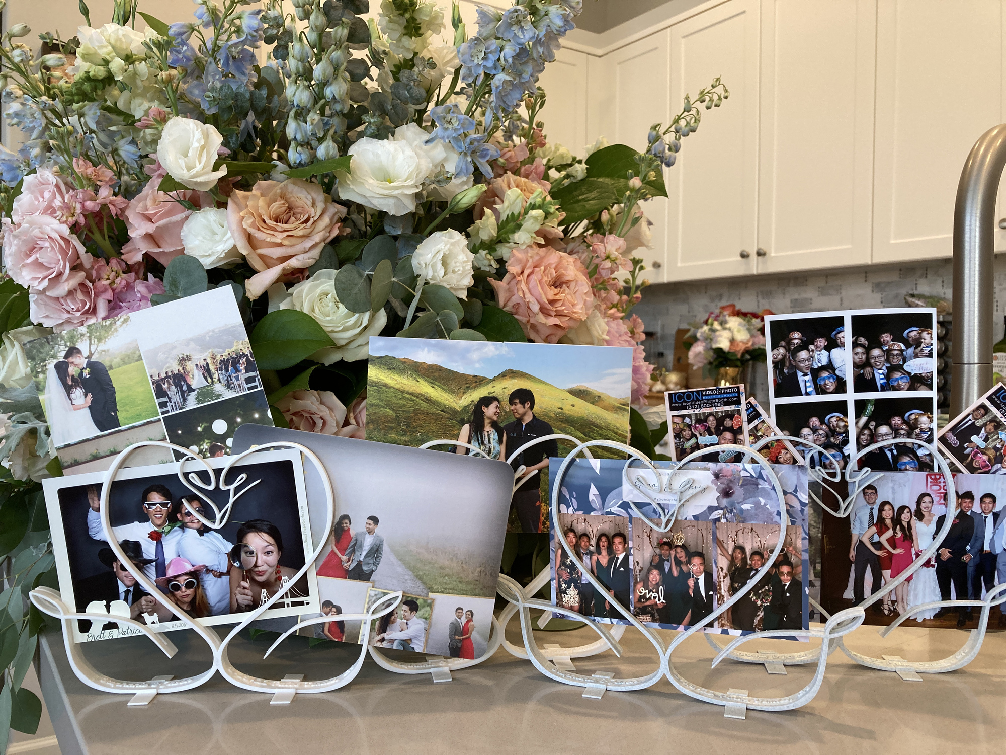
Early this year, my friend Jason commissioned me to design the party favors for his wedding. After going back and forth with a few Jason and his now wife Stephanie with a few design iterations, I completed the following final design–a sculpture of two swans with their initials (S & J) as the heads, which also doubled as a document holder able to display papers of arbitrary size.

These swans came in two colors and doubled as a namecard/document holder and as a practical favor guests could take home and reuse

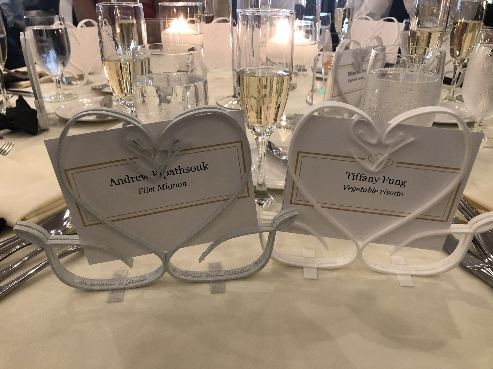
I was very happy with how all of the favors turned out after several weeks of nonstop printing and finishing the parts by hand.

These swans can hold documents, photos, etc. of arbitrary size!

For the other two weddings (Jimmy & Cat; Solomon & Sabrina), I created very similar gifts—custom cards filled with words and phrases meaningful to the couples usable for a variety of games (monikers, charades, codenames, Pictionary, etc.)

In both cases, I am fortunate to have known nearly all members of both sides of the bridal party. I was able to I reach out and had everybody fill in a spreadsheet with words and definitions. Next, I gathered artwork to use for the front and back of each card–for the game Sabrina and SoloMonikers, I reached out to Sabrina’s brilliant designer sister who was able to whip up custom artwork.

Sabrina & SoloMonikers!

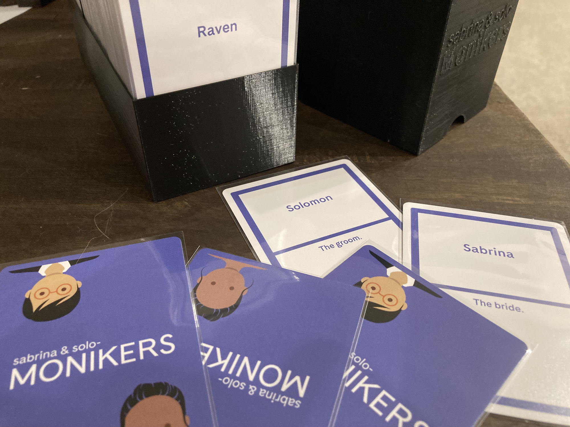
For Hao Peng Yu, I reached out to a caricature artist James and Cat previously commissioned for their Save the Dates and took some photos from their engagement shoots.

For Hao Peng Yu, I used engagement shoot photos for the front of the cards

I generated unique cards by populating the art files with words and definitions from the bridal party spreadsheets in GIMP via python script. Then I uploaded all the files to a fantastic card printer based in Hong Kong (makeplayingcards.com) who printed both ~500 card decks and had them at my door within 2 weeks! After the decks arrived, I sleeved all the cards and printed custom boxes to hold everything.

The box was custom sized to fit all the cards and a divider was included to help keep things a bit organized

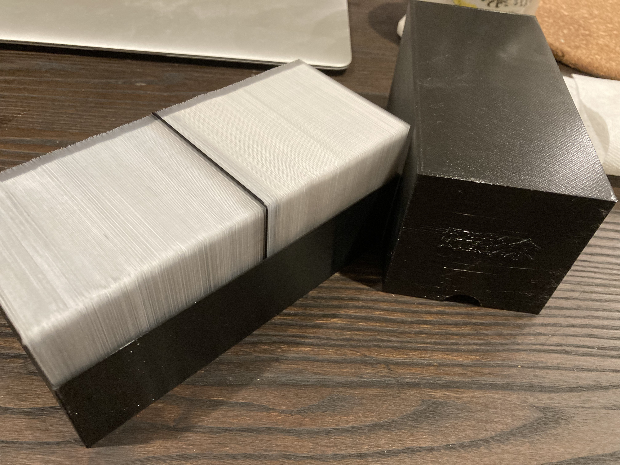
I am very proud of how both decks of cards came out, and am grateful for all the help I had from all members of all four wedding parties. Things were too hectic at both weddings for us to play with the cards–a bit unfortunate, but EXTREMELY understandable. It’s just an excuse for us to all get together again in the near future though ;).

Looking back at this crazy September, I am delighted to have played a part in making the day special for each of these happy couples! The entire month felt like it was gone in the blink of an eye, yet I know we made enough memories to last a lifetime. Despite the exhaustion and a sense of relief of being “off the clock”, I wouldn’t have traded last month for anything.

Faux-Neon Signage

TL;DR: For my friend Gina’s birthday, I made her a faux-neon sign to decorate her new condo with. I ended up making a few different versions of this sign and through the process, I learned several useful tricks to speed up vector image modifications, which will definitely make it easier for me going forward. 

I continued playing with el wire since I bought so much for my headband project. Since my friend’s birthday was coming up, I figured it was a great opportunity to make something cool with it. I decided to make a faux-neon sign reading “Mama G’s House”.

I started by searching for neon sign fonts on google and downloaded a few to try out including “Warnes”, “La Patio Script”, “I am online with u”, and “Fenotype Neon”. All of them were free to download, but not all of them were free for commercial usage, which is fine for this project as I’m not selling it.

The first prototype I made used Warnes as the base font. I really liked how the letters all connect at the bottom. However, I needed to do a bit of surgery in Inkscape to connect the disparate words after vectorization:

The main modifications I made to this first font were just around connecting the letters and adjusting some of the spacing

I imported the SVG directly into a sketch Fusion 360 and resized it to ensure I had a ~3mm wide channel all over. Next, I modified the sketch to remove areas near the bottom where the lettering overlapped. In a fashion similar to what I did for the EL headbands, I extruded a positive model of the letters. Next, I needed to move the apostrophe body and combine it with the rest of the lettering. Then, I created a sketch, offset the entire object, and cleaned up the line overlapping lines created by the offset tool. After extruding the outlined body, I cut the positive lettering model out:

I reused the technique I discovered while making the EL headbands of cutting the positive channel from the main body

After slicing the STL in Cura, and waiting about 3 hours for production, the print came out pretty well:

However, with the physical model in front of me, I saw the font I used had a few issues. Primarily, although the channels I made fit the el wire, there were too many places where stringing it required a double back, which was not accounted for. Oops. Luckily, I hadn’t spent a lot of time on this, and I figured Gina could still use it as a nice decoration even without lighting effects.

The next font I tried was called “I am online with u” which had the advantage of being a single connected line. Although this font was more ideal out of the box, I still needed to tweak the vector version to make it work properly. Essentially, I just modified the “corners” of the letters to allow for more space wherever they changed direction, I adjusted the spacing between words and letters, and I moved and combined the apostrophe to overlap with the letters.

I modified this font a bit more heavily to ensure a good print. The biggest tweak was widening the letters where they changed direction so the EL wire could bend around.

My workflow in Fusion 360 was essentially identical to the one I used for the previous version of the sign: import svg, scale, and clean up sketch -> extrude a positive channel -> offset the body and extrude the outline -> use the combine tool to cut the positive channel away from the outlined body. Unfortunately, this part was a bit too big to fit on my printer in one piece, so I needed to split it into two. The split created a physical weakness which I shored up by creating a small base to hold it together and help the entire assembly stand upright.

The split was unfortunate but necessary to allow me to actually manufacture the sign. The base I made fit very well and helps keep the assembly standing too.

The print didn’t take very long—maybe about 4 hours in total for all the pieces. I was pretty happy with the results, and I think she was too 🙂