TL;DR: For my friend Gina’s birthday, I made her a faux-neon sign to decorate her new condo with. I ended up making a few different versions of this sign and through the process, I learned several useful tricks to speed up vector image modifications, which will definitely make it easier for me going forward.
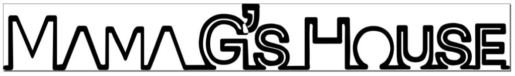
I continued playing with el wire since I bought so much for my headband project. Since my friend’s birthday was coming up, I figured it was a great opportunity to make something cool with it. I decided to make a faux-neon sign reading “Mama G’s House”.
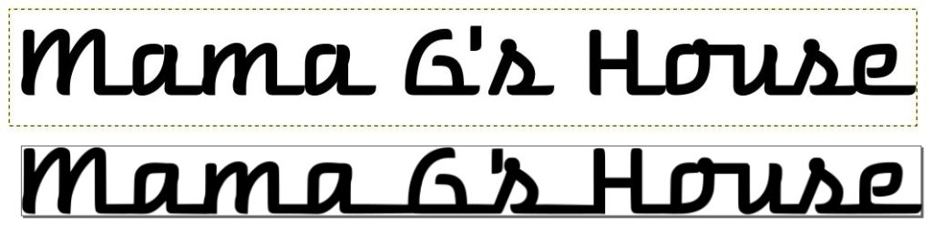
I started by searching for neon sign fonts on google and downloaded a few to try out including “Warnes”, “La Patio Script”, “I am online with u”, and “Fenotype Neon”. All of them were free to download, but not all of them were free for commercial usage, which is fine for this project as I’m not selling it.
The first prototype I made used Warnes as the base font. I really liked how the letters all connect at the bottom. However, I needed to do a bit of surgery in Inkscape to connect the disparate words after vectorization:
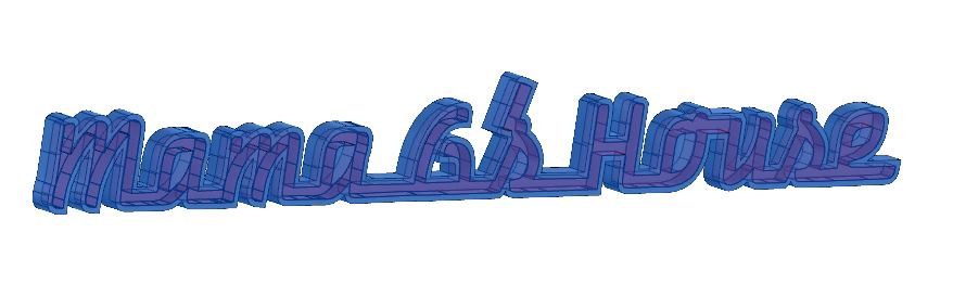
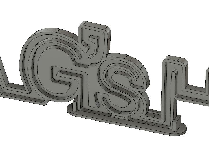
I imported the SVG directly into a sketch Fusion 360 and resized it to ensure I had a ~3mm wide channel all over. Next, I modified the sketch to remove areas near the bottom where the lettering overlapped. In a fashion similar to what I did for the EL headbands, I extruded a positive model of the letters. Next, I needed to move the apostrophe body and combine it with the rest of the lettering. Then, I created a sketch, offset the entire object, and cleaned up the line overlapping lines created by the offset tool. After extruding the outlined body, I cut the positive lettering model out:
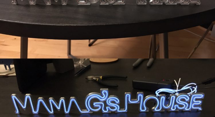
After slicing the STL in Cura, and waiting about 3 hours for production, the print came out pretty well:
However, with the physical model in front of me, I saw the font I used had a few issues. Primarily, although the channels I made fit the el wire, there were too many places where stringing it required a double back, which was not accounted for. Oops. Luckily, I hadn’t spent a lot of time on this, and I figured Gina could still use it as a nice decoration even without lighting effects.
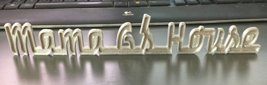
The next font I tried was called “I am online with u” which had the advantage of being a single connected line. Although this font was more ideal out of the box, I still needed to tweak the vector version to make it work properly. Essentially, I just modified the “corners” of the letters to allow for more space wherever they changed direction, I adjusted the spacing between words and letters, and I moved and combined the apostrophe to overlap with the letters.
My workflow in Fusion 360 was essentially identical to the one I used for the previous version of the sign: import svg, scale, and clean up sketch -> extrude a positive channel -> offset the body and extrude the outline -> use the combine tool to cut the positive channel away from the outlined body. Unfortunately, this part was a bit too big to fit on my printer in one piece, so I needed to split it into two. The split created a physical weakness which I shored up by creating a small base to hold it together and help the entire assembly stand upright.
The print didn’t take very long—maybe about 4 hours in total for all the pieces. I was pretty happy with the results, and I think she was too 🙂
